Color Psychology in Home Interior Design: How to Choose the Perfect Palette
Imagine stepping into a room painted in a deep, soothing blue. Instantly, a sense of calm washes over you, easing the tension of the day. This isn't just your imagination-it's the power of color psychology in home interior design. Understanding how different hues impact emotions and behaviors can transform your living space into a sanctuary that feels just right. In this article, we'll explore foundational concepts of color psychology, delve into data-driven insights, and offer actionable strategies for selecting the perfect color palette. We'll also dive into expert-level details to guide your choices and provide additional depth to enhance your design process.
The Science of Color Psychology
Color psychology is the study of how colors affect human behavior and emotions. It's a concept utilized extensively in marketing but equally influential in home interior design. Research suggests that colors can evoke specific psychological responses; for instance, red is known to stimulate appetite, which is why it's often used in dining rooms, while blue tends to have a calming effect, making it ideal for bedrooms. Understanding these responses can help you select colors that align with the mood you want to create in each room.
According to a study by the University of Winnipeg, up to 90% of snap judgments made about products can be based on color alone. This underscores the importance of carefully considering your color choices in home design. The same study found that individuals perceive colors differently based on personal experiences and cultural backgrounds. This variability means that while certain colors may have common associations, the impact can differ greatly among individuals.
It's important to note that color preferences are not just about aesthetics. They can also influence energy levels and productivity. For example, yellow is often associated with energy and creativity, making it a popular choice for home offices or creative spaces. By understanding these foundational concepts, you can begin to see how color choices are not just about visual appeal but also about creating functional and emotionally resonant spaces.
Having established the foundational concepts, the next logical step is to explore how these principles play out in real-world data and analysis.
Analyzing Color Trends and Preferences
Trends in color preferences can be both insightful and telling. The annual survey by Houzz reveals that more than 50% of homeowners prefer neutral tones like greys and beiges for their living spaces, indicating a desire for versatility and modern aesthetics. These colors serve as a blank canvas, allowing for personal expression through furniture, art, and accessories. However, it's critical to balance these neutrals with accent colors to avoid a sterile environment.
Data from the American Society of Interior Designers (ASID) suggests that there's been a significant uptick in the use of biophilic design, which emphasizes natural elements like greens and browns. This trend is driven by a growing awareness of sustainability and a desire to bring the calming effects of nature indoors. Integrating these colors can help create a sense of tranquility and connection to the outside world, which is particularly beneficial in urban settings where access to nature may be limited.
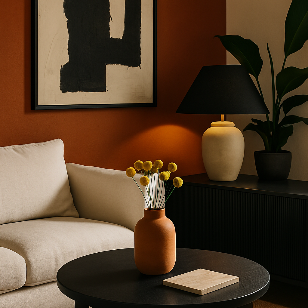
Interestingly, a report by the International Interior Design Association (IIDA) highlights the rise of bold colors like terracotta and navy blue. These choices reflect a shift towards more personalized and expressive interiors. The data suggests that homeowners are increasingly willing to experiment with color, moving away from the safety of neutrals. This willingness to embrace bold colors can be attributed to the influence of social media platforms like Instagram and Pinterest, where vibrant, eye-catching designs often gain traction.
With a deeper understanding of current trends and preferences, the next step involves practical strategies for incorporating these insights into your home.
Strategies for Selecting the Perfect Palette
Choosing the perfect color palette requires a strategic approach that considers both psychological impact and aesthetic appeal. Start by evaluating the function of each room. For instance, a living room intended for relaxation might benefit from cool tones like soft blues or greens, while a kitchen could be invigorated with warm hues like orange or red. Think about how you want to feel in each space and let that guide your color choices.
Experienced professionals often recommend starting with a base color and then building a palette around it. This base color should be one that you love and can envision living with for an extended period. From there, select complementary colors using a color wheel. This tool can help you identify harmonious combinations, such as analogous colors, which are next to each other on the wheel, or complementary colors, which are opposite each other.
Don't forget to factor in lighting when deciding on your color palette. Natural light can significantly alter the appearance of colors, so it's essential to test paint samples at different times of the day. Artificial lighting, such as LED or incandescent bulbs, can also impact how colors are perceived. By considering these elements, you can ensure that your chosen palette remains consistent throughout the day and complements the room's overall ambiance.
With a strategic framework in place, it's essential to consider expert insights that can further refine your palette selection process.
Expert Insights: Beyond the Basics
Certified interior designers, particularly those with NCIDQ (National Council for Interior Design Qualification) credentials, bring a wealth of knowledge to the table when it comes to color selection. They emphasize the importance of considering the architectural style of your home. A modern minimalist space may call for a different palette than a traditional Victorian home, where rich, saturated colors might enhance the classic details.
Additionally, professionals often advise paying attention to the flow between rooms. Rather than treating each room as an isolated space, consider how colors transition from one area to the next. This approach ensures a cohesive and harmonious environment, which is particularly important in open-plan living spaces. Using a consistent color palette with subtle variations can help tie different areas together while still allowing for unique expressions in each room.
Another expert tip involves using color to highlight architectural features. For instance, painting a feature wall in a bold color can draw attention to a fireplace or a beautiful piece of art. Similarly, using lighter shades on ceilings can create a sense of height and airiness. By strategically applying color, you can enhance the architectural beauty of your home and create focal points that capture attention.
Having explored expert insights, let's delve into additional layers of detail that can further inform your color choices.
Additional Depth: Cultural and Personal Influences
While trends and expert advice provide a solid foundation, it's crucial to consider personal and cultural influences on color perception. Colors hold different meanings across cultures; for instance, white is often associated with purity and peace in Western cultures but can signify mourning in some Eastern traditions. Understanding these nuances can help you choose colors that resonate personally and culturally.
Your personal experiences and memories also play a significant role in color preferences. Perhaps a certain shade of yellow reminds you of childhood summers spent in your grandmother's kitchen, or a deep green evokes memories of family vacations in the forest. These emotional connections can make a color feel more inviting and meaningful in your space. When selecting a palette, reflect on colors that hold positive associations for you and consider incorporating them into your design.
Finally, don't hesitate to seek inspiration from diverse sources. Platforms like Instagram and Pinterest are treasure troves of creative ideas and can help you visualize how different palettes work in real spaces. By exploring a variety of design styles and interpretations, you can gain a broader perspective on how to use color effectively in your home.
With these additional insights in mind, let's conclude with final perspectives on the power of color in interior design.
The Power of Color: Final Perspectives
Color is an incredibly powerful tool in interior design, capable of transforming not only the aesthetics of a space but also its emotional atmosphere. As you embark on the journey of selecting the perfect palette, remember that your choices should align with both the function of the space and your personal preferences. The right colors can enhance your daily life, making your home a true reflection of your personality and style.
As you refine your palette, consider the broader impact of your choices. Well-designed interiors can increase the resale value of your home by 5-15%, according to industry surveys. This financial benefit underscores the importance of thoughtful color selection not just for personal satisfaction, but also for long-term investment.
Ultimately, color is a powerful way to express yourself and create an environment that supports your lifestyle. With the insights and strategies shared in this article, you are well-equipped to make informed decisions that will bring your vision to life.
Conclusion: Your Next Steps
In conclusion, color psychology in home interior design is a dynamic field that blends science, art, and personal expression. By understanding the psychological effects of color, analyzing current trends, and applying expert strategies, you can select a palette that transforms your space into a haven. As you embark on your design journey, start by exploring platforms like Houzz and Pinterest to gather inspiration and refine your preferences.
Begin your next project by experimenting with color swatches and observing how they interact with your home's lighting and architecture. Don't rush the process; take the time to ensure your color choices feel right for you. If you're ready to take the next step, consider consulting with a certified interior designer to gain professional insights and guidance tailored to your specific needs.
Start by browsing designer portfolios on Houzz this week-even 20 minutes of research will sharpen your eye for what you want. With a thoughtful approach, you can create a home environment that truly reflects your personality and brings you joy every day.


Comments
Post a Comment