Color Psychology in Bedroom Design: Create a Relaxing Retreat at Home
Color is the single most powerful tool in a bedroom designer's arsenal, yet it is often chosen based on fleeting preference rather than informed strategy. The science of color psychology, which examines how different hues affect human emotion, cognition, and physiology, offers a rigorous framework for selecting bedroom palettes that actively support relaxation and sleep. The American Society of Interior Designers (ASID) has long advocated for evidence-based color selection in residential projects, noting that bedrooms painted in colors aligned with their occupants' psychological needs consistently outperform those designed on aesthetic instinct alone. A 2022 survey conducted by the National Sleep Foundation found that respondents who described their bedroom color as calming reported falling asleep an average of eighteen minutes faster than those who described their walls as stimulating or neutral. Those minutes compound into hours of additional sleep each month, making color selection not just a design decision but a wellness intervention with measurable consequences.
The Science Behind Color and Emotion
Color psychology is grounded in decades of research spanning neuroscience, environmental psychology, and clinical therapy. When light of a particular wavelength enters the eye, it triggers responses not only in the visual cortex but also in the limbic system, the brain region responsible for emotional processing. Warm colors like red and orange activate the sympathetic nervous system, increasing heart rate and alertness, while cool colors like blue and green stimulate the parasympathetic system, promoting calm and lowering blood pressure. These responses are not purely cultural or subjective; they have been documented across diverse populations and are believed to have evolutionary roots in our species' long relationship with natural environments.
The saturation and brightness of a color matter as much as its hue. A pale, muted blue has a profoundly different psychological effect than a vivid electric blue, even though both occupy the same position on the color wheel. The IIDA recommends that bedroom colors be chosen at low to medium saturation and medium to low brightness for maximum relaxation benefit. Highly saturated colors demand visual attention and can create a sense of stimulation that is desirable in social spaces but counterproductive in a room dedicated to rest. Think of the difference between the soft blue of a clear morning sky and the intense blue of a neon sign; both are blue, but only one belongs on a bedroom wall.
Context also shapes how a color is perceived. The same shade of green will feel different on a north-facing wall that receives cool indirect light than on a south-facing wall bathed in warm sunshine. Adjacent colors, furniture finishes, and even the color temperature of your lightbulbs all modify the appearance and psychological impact of your wall color. This is why the NCIDQ examination tests designers on the interaction between color, light, and surface, because understanding these relationships is essential to predicting how a color choice will actually feel once it is applied. A large paint sample tested on your wall under both natural and artificial light for at least forty-eight hours is the only reliable way to evaluate a color before committing to it.
Blues and Greens: The Foundations of Bedroom Calm
Blue is consistently identified as the most calming color for bedroom environments across cultures and demographics. Houzz survey data from 2024 shows that soft blue remains the single most popular bedroom wall color among both homeowners and designers, and its dominance has only strengthened as awareness of sleep hygiene has grown. The physiological basis for blue's calming effect is well established: blue light wavelengths trigger the production of melatonin precursors and activate the parasympathetic nervous system, creating a biological state that is conducive to drowsiness and relaxation. Muted blues, particularly those with gray or green undertones, are especially effective because they avoid the clinical coldness of pure blue while retaining its soothing properties.
Green occupies a similar position in the color psychology hierarchy, with the added benefit of strong biophilic associations. Our brains interpret green as a signal of safety, fertility, and abundance, which are calming signals rooted in our evolutionary history as a species that relied on green landscapes for survival. Sage green, olive, and soft eucalyptus tones have surged in popularity for bedrooms, appearing prominently in ASID color trend reports and on the mood boards of leading residential designers. Green pairs naturally with warm wood tones and neutral textiles, making it one of the most versatile bedroom colors available. Do you find yourself drawn more to blue or green as a calming influence, and have you considered what that preference reveals about your personal response to color?
Combining blue and green in a single bedroom palette is entirely viable and often produces results that are richer and more nuanced than either color alone. A blue-green wall color paired with green plants and blue-gray bedding creates a layered, nature-inspired environment that feels immersive without being overwhelming. The Japandi design philosophy embraces this kind of tonal layering, using closely related hues to build depth without contrast. When selecting your specific shades, look for undertones that harmonize rather than clash: a blue with a slight green cast will coexist peacefully with a green that leans slightly blue, while a pure cerulean blue beside a warm yellow-green may create an uncomfortable visual tension.
Warm Neutrals: Safety Without Sterility
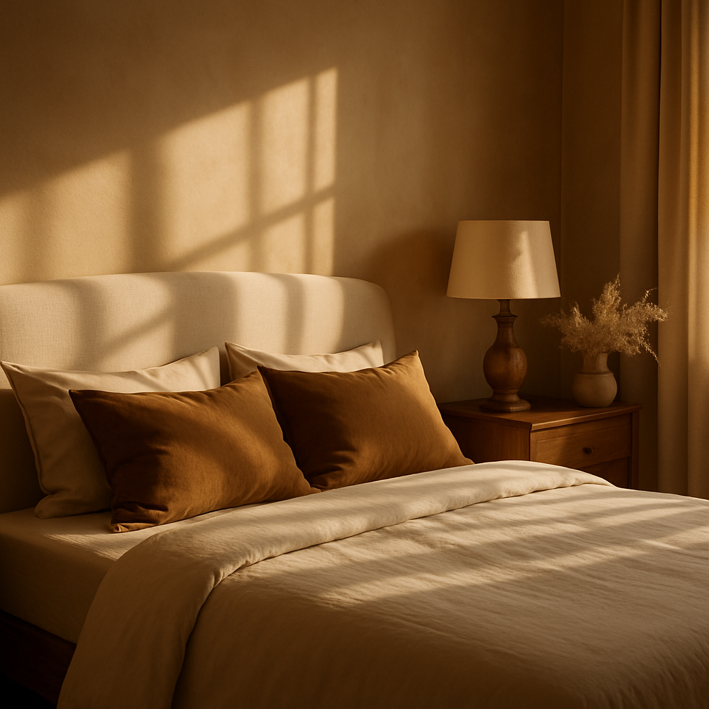
Not everyone responds optimally to cool colors, and for those individuals, warm neutrals offer an equally effective path to bedroom relaxation. Warm whites, taupes, soft beiges, and creamy ivories create a sense of enclosure and safety that mimics the experience of being wrapped in a familiar blanket. AD PRO color forecasts for 2024 highlight a decisive shift away from the cool grays that dominated bedroom design for much of the previous decade, replaced by warm, earthy neutrals that feel more human and less institutional. This shift reflects a broader cultural desire for comfort and groundedness, and it aligns with color psychology research showing that warm tones activate feelings of security and contentment.
The challenge with warm neutrals is avoiding blandness. A room painted entirely in beige with beige furniture and beige bedding will feel monotonous rather than calming, because the eye has nothing to rest on or move toward. The solution is textural variety: pairing smooth plaster walls with a rough linen headboard, a nubby wool throw with crisp cotton sheets, and matte ceramic accessories with polished wood surfaces. These textural contrasts create visual interest within a restrained palette and prevent the room from feeling flat. NCIDQ-certified designers often describe this approach as creating a "tone-on-tone" composition, where the design interest comes from surface quality rather than color difference.
Warm neutrals also serve as an ideal foundation for seasonal color updates. A neutral bedroom can be refreshed with a set of terracotta-toned pillows in autumn, soft blue throws in summer, or deep plum accents in winter without repainting or replacing major furniture pieces. This adaptability makes warm neutrals a pragmatic choice for homeowners who enjoy change but do not want to commit to a strongly colored room that may feel restrictive after a few months. The emotional stability of the neutral base remains constant while the accent elements evolve, and the result is a bedroom that feels simultaneously timeless and responsive to its occupant's changing moods and preferences.
Colors to Approach with Caution in Bedrooms
While most colors can be used effectively in a bedroom when handled with skill, certain hues require particular care to avoid undermining the room's relaxation function. Bright reds and oranges are the most frequently cited problem colors in bedroom design, because their stimulating effect on the nervous system directly opposes the calm required for restful sleep. A 2023 study referenced by ASID found that bedrooms with dominant red or orange walls were associated with an average of thirty-two fewer minutes of sleep per night compared to bedrooms with blue or green walls. If you love warm tones, consider deeper, desaturated versions like terracotta, burnt sienna, or wine, which retain the warmth without the stimulating intensity.
Pure white, despite its association with cleanliness and simplicity, can be problematic in bedrooms for different reasons. Large expanses of bright white reflect light harshly, creating a clinical or institutional atmosphere that many people find difficult to relax in. White also shows every imperfection in wall surface and construction, and it can appear cold or blue-gray under artificial lighting unless carefully calibrated with warm-toned bulbs. If white is your preferred color, opt for warm whites with yellow, pink, or peach undertones, and ensure your lighting scheme supports the warmth you are trying to achieve. The difference between a cold white and a warm white on a bedroom wall is often the difference between a room that feels like a hospital and one that feels like a cloud.
Black and very dark colors represent an interesting edge case. While dark bedrooms have gained popularity through social media and the quiet luxury movement, they require careful execution to avoid feeling oppressive. Dark walls absorb light rather than reflecting it, which means the room must be compensated with additional light sources and reflective surfaces to prevent a cave-like atmosphere. In bedrooms with ample natural light and generous proportions, dark colors can create a dramatic, cocoon-like retreat that is genuinely conducive to sleep. In small or poorly lit bedrooms, however, the same colors may trigger feelings of confinement and anxiety. Honest self-assessment of your room's conditions and your personal tolerance for darkness is essential before committing to a deeply saturated palette.
Applying Color Psychology to Specific Bedroom Zones
A bedroom is not a single-purpose space, and different zones within the room benefit from different color treatments. The sleep zone, centered on the bed and its immediate surroundings, should prioritize the most calming colors in your palette. This is where your most soothing wall color, your gentlest bedding tones, and your softest lighting should converge. If your bedroom includes a reading nook or a small desk area, that zone can accommodate slightly more stimulating colors, such as a warmer accent wall or a desk lamp with a brighter, cooler light, to support focus without disrupting the overall calming atmosphere. The IIDA advocates for this zoned approach in multipurpose bedrooms, recognizing that a single uniform treatment often fails to serve competing functional needs.
The ceiling is a frequently neglected surface that plays a significant role in your color experience when you are lying in bed. Painting the ceiling a shade or two lighter than the walls lifts the perceived height of the room and creates a gentle gradient that the eye finds restful. Conversely, a slightly darker ceiling, sometimes called a "fifth wall" treatment, creates an enveloping, den-like sensation that some sleepers find deeply comforting. Houzz designers report that ceiling color requests have increased by 28% year-over-year as homeowners recognize the impact of this often-ignored surface. Which approach appeals to you will depend on whether you associate relaxation with openness or enclosure, and both are valid expressions of the same underlying desire for comfort.
Transitional spaces within the bedroom, such as the closet interior, the ensuite bathroom doorway, and the area immediately inside the bedroom door, benefit from color continuity with the main room. Abrupt color changes at these boundaries create visual fragmentation that makes the room feel smaller and less cohesive. Carrying your primary wall color into the closet and using it as the trim color in an attached bathroom creates seamless visual flow that unifies the entire bedroom suite. This continuity reinforces the psychological impression of a single, coherent sanctuary rather than a collection of disconnected functional spaces sharing a floor plan.
Testing and Committing to Your Palette
The gap between a color as it appears on a screen or a paint chip and the same color on a full-scale wall is often dramatic, and this disconnect is the primary source of dissatisfaction in bedroom color projects. Professional designers always test colors in situ before committing, and you should adopt the same discipline. Purchase sample pots of your top three to five candidates and paint large swatches, at least two feet by two feet, on multiple walls of the room. Observe each swatch in morning light, afternoon light, artificial light, and darkness over a minimum of forty-eight hours. The color that looks perfect at noon may appear dingy at dusk or garish under your bedside lamp, and only extended observation will reveal these shifts.
Pay attention to your emotional response at different times of day, not just your visual impression. Does the color feel calming when you first see it upon waking? Does it recede comfortably into the background during the day? Does it create a sense of warmth and enclosure when the lights are dimmed at night? These experiential questions are more important than whether the color looks good in a photograph, because you will be living with it at close range and in varying conditions for months or years. ASID recommends keeping a brief color journal during the testing period, noting your mood and energy level each time you enter the room, to identify patterns that might not be apparent from casual observation.
Once you have selected your color, commit to it fully rather than hedging with a lighter or safer version. A color chosen through rigorous testing and extended observation deserves to be applied with confidence. Paint all the walls, not just one accent wall, unless your design plan specifically calls for a feature wall treatment. The immersive effect of a single enveloping color is almost always more calming and more sophisticated than the segmented effect of multiple colors competing for attention. Professional painters recommend two coats minimum for even coverage and a third coat for deeply saturated colors. The investment in proper application ensures that your carefully chosen color delivers the psychological benefits that motivated the selection process in the first place.
Conclusion
Color psychology transforms bedroom design from a matter of personal taste into a discipline grounded in neuroscience, environmental psychology, and decades of professional practice validated by organizations like the ASID, IIDA, and the NCIDQ. The colors that surround you during sleep affect your nervous system, your mood, and your long-term well-being in ways that are measurable and significant. Blues and greens promote physiological calm, warm neutrals create feelings of safety and comfort, and careful attention to saturation, brightness, and context ensures that your chosen palette performs as intended under real-world conditions. The testing process described above requires patience, but the reward is a bedroom color scheme that has been validated by your own lived experience rather than guessed at from a magazine spread. This week, pick up two or three sample pots in the color family that appeals to you most, paint your test swatches, and begin paying attention to how each shade makes you feel at different times of day. That simple act of observation is the first step toward a bedroom that genuinely serves your rest.


Comments
Post a Comment