Mantel Vignette Composition Rules Anchored by Tall Element
The mantel is the single most photographed surface in a traditional home, and arguably the most challenging to style well. Unlike a coffee table or a console, the mantel sits at eye level, demands to be noticed, and frames the architectural focal point of the entire room. A poorly styled mantel undermines the fireplace it crowns, while a thoughtfully composed mantel elevates the entire living space and gives the room a clear visual heart. The difference between the two outcomes almost always comes down to one principle: the presence of a strong tall element that anchors the composition.
Interior designers have long understood that horizontal surfaces need vertical interruptions to read as intentional. On a mantel, this principle becomes essential because the natural shape of the surface is so emphatically horizontal. Without a tall anchor, mantel vignettes tend to spread out into a parade of small objects that the eye reads as visual noise. With a tall anchor, the same objects suddenly cohere into a composition with a clear point of emphasis. House Beautiful has demonstrated this principle in nearly every styled mantel feature it has ever published, and once you start looking for the tall anchor in mantel photography, you will see it everywhere.
Why The Tall Element Matters So Much
The tall element on a mantel performs several jobs at once. It establishes the maximum height of the composition, which gives every other object on the mantel a relationship to negotiate. It draws the eye up from the fireplace and into the room above the mantel, connecting two architectural zones that would otherwise feel disconnected. And it provides a clear focal point that prevents the eye from wandering aimlessly across an otherwise flat surface.
Without a tall anchor, even beautifully chosen objects tend to feel scattered. You can have a perfect collection of candlesticks, framed photos, and seasonal greenery, but if nothing rises significantly above the rest of the composition, the entire vignette feels low and squat. Architectural Digest has frequently noted in residential styling features that the eye seeks vertical interruption on horizontal surfaces, and providing that interruption is the single fastest way to make any surface look more designed.
The American Society of Interior Designers (ASID) has reported in design education materials that roughly 65 percent of homeowners who attempt to style their mantel feel their result lacks visual impact. The fix in nearly every case is the same. Replace the small framed photos and modest objects with at least one substantial vertical element, and the entire composition snaps into focus. Have you looked at your own mantel and asked whether anything on it actually rises with confidence above the rest of the surface?
Choosing The Right Tall Anchor For Your Style
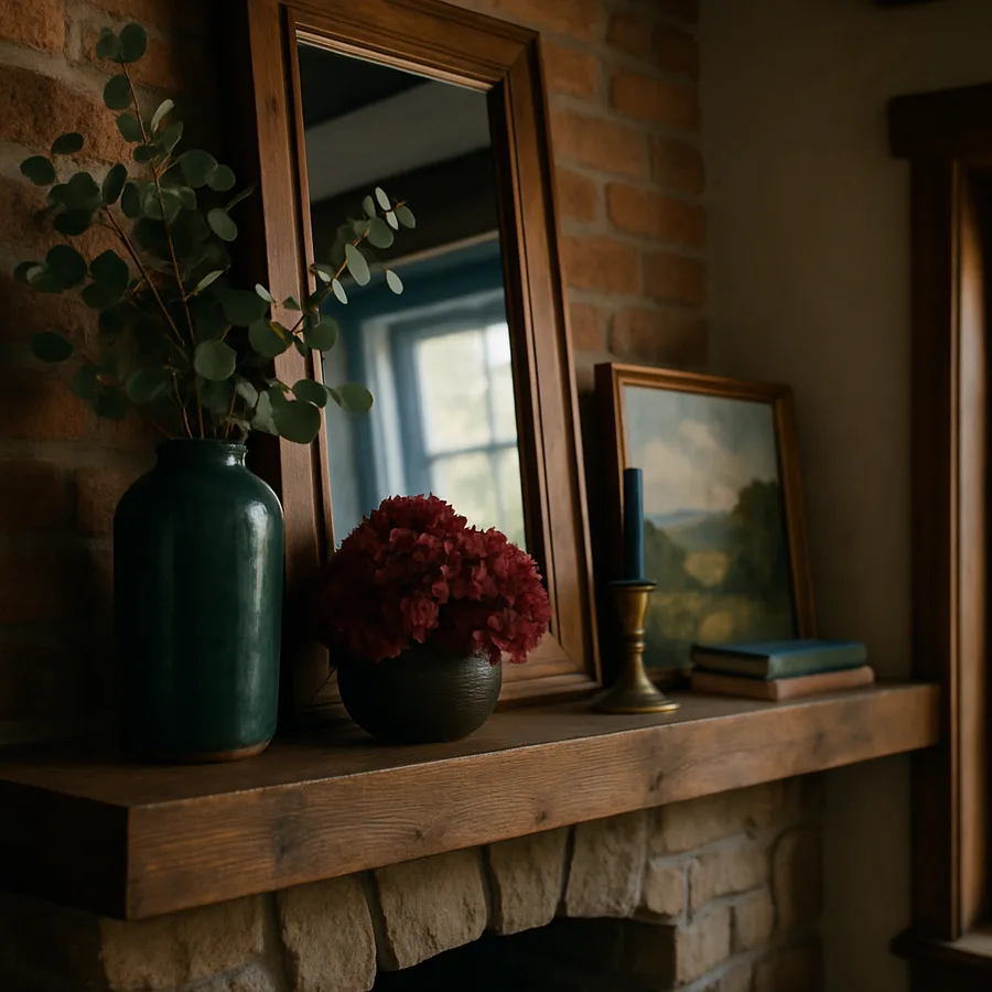
The tall anchor on a mantel can take many forms, and the right choice depends on your room's overall design language. The most classic option is a large mirror, either propped against the wall or hung above the mantel. A mirror not only provides height but also reflects light back into the room and creates the illusion of additional space. For traditional and transitional interiors, a large mirror in a substantial frame is almost always a safe and effective choice.
For more contemporary spaces, a single large piece of art, propped or hung, often works better than a mirror. The art carries personality and color in a way that a mirror cannot, and a single bold piece can carry the entire mantel composition by itself, requiring only minimal additional styling. Sherwin-Williams educators have noted in color theory guidance that a strong piece of art above a mantel functions as both focal point and color anchor, often setting the palette for the entire room without any other intervention required.
For organic, layered, or eclectic styles, the tall anchor can be a sculptural object such as a tall ceramic vessel, a substantial branch in a vase, or even a stacked pair of objects that together reach the necessary height. Better Homes and Gardens has covered the rise of natural-element anchoring in shelter coverage extensively, noting that branches, dried grasses, and large sculptural vessels have become some of the most popular mantel anchors because they bring scale and texture in a single move. Have you considered which type of anchor best fits the personality of your room?
The Two Thirds Rule For Anchor Height
Once you have chosen the type of anchor, the next question is how tall it should actually be. The most reliable guideline is the two thirds rule. Your anchor should rise at least two thirds of the way to the ceiling from the top of the mantel, or in low-ceiling rooms, it should reach close to the ceiling itself. An anchor that is too short looks insecure and apologetic, while one that is too tall can feel oppressive in a smaller room.
If your ceilings are eight feet and your mantel is four feet from the floor, you have four feet of vertical space above the mantel to work with. A tall anchor in this scenario should rise at least 32 inches above the mantel surface. In rooms with ten foot ceilings or higher, the anchor can be more dramatic, rising five or six feet above the mantel for true grandeur. Architectural Digest has featured countless rooms where the anchor reaches nearly to the ceiling, and the visual impact is consistently breathtaking.
Width also matters, though less than height. A tall anchor that is too narrow can feel thin and ineffective, while one that is too wide can dominate the entire mantel. Aim for an anchor width roughly between one third and one half the length of the mantel itself. This proportion gives the anchor enough presence to register as significant without overpowering the supporting elements arranged around it. The remaining mantel surface on either side becomes the canvas for the layered vignette.
Building Asymmetrical Balance Around The Anchor
Once your tall anchor is in place, the rest of the mantel should be styled with deliberate asymmetry. Symmetrical mantels with matching elements on each side of the anchor can look formal and beautiful, but they tend to feel static. Asymmetrical compositions feel more relaxed and read as more sophisticated to the contemporary eye. The challenge is achieving balance without symmetry, which requires understanding visual weight rather than physical matching.
A useful approach is to place the tall anchor slightly off-center on the mantel. Then arrange a heavier cluster of objects on the side opposite the anchor to balance its visual weight. The heavier cluster might include a stack of books, a substantial candle, or a small grouping of objects together. The side closer to the anchor stays lighter, perhaps with just a single small object or a piece of greenery cascading down off the edge of the mantel.
Think of the mantel as a seesaw with the anchor sitting closer to one end. The cluster on the opposite end has to do more visual work to balance the weight of the anchor, and the result is an arrangement that feels both balanced and dynamic. House Beautiful has shown this asymmetrical approach in many of its most memorable mantel features, and the consistent takeaway is that asymmetrical balance reads as more current than its symmetrical counterpart, particularly for homeowners trying to move beyond formal traditional styling.
Layering And Overlap For Depth
Flat mantels look like museum displays, while layered mantels look like the work of a designer. Layering means deliberately overlapping objects so the eye perceives depth rather than a row of separate items. Behind your anchor, the wall provides the deepest plane. The anchor itself sits at the next plane forward. In front of the anchor, you can place additional objects that partially obscure the anchor, creating a sense of dimensional richness.
Common layering moves on a mantel include propping a smaller framed art piece in front of the larger anchor, placing a candle or small sculptural object that breaks the bottom edge of the anchor, or letting greenery trail from a vessel down across the front of the anchor. Each of these moves creates overlap, and overlap is what signals depth to the human eye. Pantone has highlighted in color and design forecasting that tactile depth in residential interiors has become a defining characteristic of designer work, distinguishing intentional spaces from those that feel merely furnished.
The cascading element is particularly powerful. Trailing eucalyptus, ivy, or even a fabric scarf draped from a vessel creates downward movement that softens the rigid horizontal line of the mantel itself. This single move can transform a stiff mantel into a relaxed and inviting one. Why does this work so well? Because the human eye associates downward flow with naturalness and ease, while sharp horizontal edges read as architectural and formal. A small amount of cascade goes a long way toward warming up the entire fireplace zone.
Adapting The Formula Through The Year
One of the joys of mantel styling is that it invites seasonal evolution in a way few other surfaces do. The framework of tall anchor plus asymmetrical layered vignette stays constant, but the specific elements rotate through the year. In spring, the cascading element might be flowering branches and the supporting objects might include pastel ceramics. In autumn, the cascade becomes dried wheat or copper-toned foliage and the objects shift toward warm earth tones.
Holiday styling is the moment when many homeowners feel pressure to over-decorate the mantel. Resist this impulse. The same principles that govern everyday styling apply during holidays, just with seasonal materials. A garland can serve as the cascading layer rather than as the entire mantel decoration. Stockings can hang at the front of the mantel without crowding the styled vignette behind them. Restraint during peak decoration moments is what separates a mantel that looks magazine-styled from one that looks like a craft store exploded.
The American Society of Interior Designers has consistently emphasized that the mantel benefits from being treated as a permanent composition that gets seasonally edited rather than as a holiday-specific surface that gets reinvented from scratch every few months. The permanent anchor stays. The supporting cast rotates. This approach saves time, prevents storage chaos, and produces consistently better results than starting over each season. Have you considered which elements of your current mantel could become permanent anchors that simply get re-dressed seasonally?
Conclusion
The mantel is a small surface with outsized influence on how a room reads. It frames the fireplace, anchors the focal wall, and signals the design sensibility of the entire home. Styling it well is one of the highest-leverage moves any homeowner can make, and the returns on a few hours of thoughtful composition are visible every single day to anyone who walks into the room.
The single most important principle is the presence of a strong tall element that anchors the entire composition. Without it, even beautiful supporting objects fall flat. With it, almost any combination of layered objects can come together into a cohesive vignette. Choose your anchor with intention, sized appropriately for your ceiling height and mantel width, and let it set the tone for everything else on the surface.
Beyond the anchor, embrace asymmetrical balance, deliberate overlap, and a willingness to let some elements cascade gently downward to soften the rigid horizontal line of the mantel itself. Treat the entire composition as a permanent piece of design that evolves seasonally rather than a holiday-only display that gets reinvented from scratch. This approach produces consistently better results with significantly less effort, and it allows your mantel to become a quiet ongoing project rather than a stressful seasonal scramble.
Ready to give your mantel the attention it deserves? Start by removing everything currently on it and assessing the empty surface as the canvas it really is. Then choose your tall anchor first, before any supporting cast, and let the rest of the composition build from that single decision. Anchor with confidence, balance with asymmetry, layer with depth, and your mantel will become not just the visual heart of the room but a daily reminder that great design starts with a single strong move and builds quietly from there.
More Articles You May Like


Comments
Post a Comment