Bookshelf Styling Rules of Three for Visually Pleasing Arrangements
A bookshelf is one of the few pieces of furniture that doubles as a personal portrait, telling visitors what you read, what you collect, and how you see the world. Yet most shelves end up cluttered or sparse because we treat them like storage rather than composition. The simplest fix in interior styling is the rule of three, a centuries-old design principle borrowed from painting and photography that arranges objects in odd-numbered groupings to create natural visual rhythm. Designers featured by Architectural Digest rely on this rule almost obsessively because it eliminates the symmetrical stiffness that makes shelves feel like museum displays.
The reason three works so well is rooted in cognitive science. Researchers at the University of California found that the human brain processes asymmetrical groupings about 20 percent faster than symmetrical ones, which is why a trio of objects always reads as more dynamic than a perfectly mirrored pair. Three creates tension, story, and movement, the three things that turn a bookshelf from a storage unit into a focal point. When you stop counting books and start counting groupings, your shelves stop fighting you and start working as a single unified composition.
Why the Rule of Three Works for Bookshelves
The rule of three is grounded in Gestalt psychology, specifically the principle of grouping, which states that the eye naturally clusters items into perceptual units. A pair of objects forces the brain to compare them as equals, while a trio invites the eye to wander, creating a small narrative arc with a beginning, middle, and end. On a bookshelf, this translates to compositions that feel collected over time rather than purchased in a single weekend.
According to a 2024 design survey published by the American Society of Interior Designers (ASID), more than 67 percent of professional stylists cite odd-numbered groupings as their most-used composition technique for built-ins and open shelving. The ASID report attributes this preference to the way odd numbers prevent the eye from settling, which keeps the viewer engaged longer with the overall vignette rather than fixating on a single object.
Another reason three works so beautifully on shelves is scale flexibility. You can apply the rule horizontally across a single shelf, vertically across three stacked shelves, or in three-dimensional layered groupings that combine height, depth, and texture. Three becomes a fractal, repeating itself at every scale of the unit. Once you train your eye to spot triangles forming inside your shelving, every other styling decision becomes easier.
Have you ever stared at your shelves wondering why they still feel cluttered even after a thorough edit? The answer is almost always that you have too many groupings of two or four, which create visual ties that the brain reads as indecision. Switching even half of those pairings to trios will instantly settle the composition.
Building Your First Triangle Composition
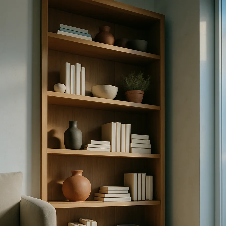
The triangle is the foundational shape behind every successful bookshelf. Designers from Studio McGee to Athena Calderone use invisible triangles to anchor their styling, with the tallest object forming the apex and two shorter objects creating the base. This shape gives the eye a clear path to follow, and it works whether the trio is a stack of art books, a sculpture, and a small vase, or a tall candle, a framed photo, and a brass bowl.
Begin every shelf with the tallest piece first. A ceramic vase, a stack of vertical hardcover books, or a piece of sculptural art roughly twelve to sixteen inches tall usually anchors a standard shelf well. Place this object slightly off center, never dead middle, because asymmetry is what activates the rule of three. From there, choose a medium-height object such as a small framed picture or a layered horizontal book stack and place it at a different depth to introduce dimension.
The third piece is where most people stop too soon. A small bowl, a polished stone, or a tiny botanical specimen completes the base of the triangle and grounds the composition. Layering depth matters more than layering height, so set the smallest object slightly forward of the others to create overlap. This subtle staggering is what gives professional shelves their lived-in, collected quality.
If you want to test whether your triangle is working, snap a photo with your phone and convert it to grayscale. Stripping away color reveals the value structure, and a strong triangle will read clearly even without saturation. This trick is favored by editors at Better Homes and Gardens when they style shoots, because it confirms the shape before they fuss with finishing details.
Mixing Heights, Textures, and Materials in Threes
A bookshelf composed entirely of books and ceramics will quickly feel monotonous, no matter how perfect the triangles. The rule of three extends beyond object count to material variety, which is why the strongest shelves contain trios of texture as well as trios of objects. Aim for three core material families per shelf, such as wood, ceramic, and woven fiber, or brass, leather, and stone. This material rhythm is what gives a vignette the depth that photographs so beautifully in magazines.
The same principle applies to height variation. A trio of objects all the same height reads like a chorus line, predictable and flat. A trio with three distinctly different heights creates the cascading staircase effect that designers describe as visual movement. Keep the height differential meaningful, ideally with at least two to three inches separating each piece, so the contrast registers from across the room.
Texture works the same way. If you mix three smooth objects, the shelf feels cold, while three rough objects feel chaotic. Combine one smooth, one matte, and one woven or organic texture, and the shelf earns the Tactile Trinity that custom builders often note in their portfolios. Touch-readability matters because the eye reads texture before it reads color, which is why a velvet pillow next to a polished marble bowl is more compelling than two equally polished items.
Color follows the same odd-number logic. A trio of accent colors, repeated three times across a unit, creates cohesion without monotony. Pick a dominant neutral such as oatmeal or warm white, then add three accent shades like terracotta, sage, and ink. Repeating those three accents across multiple shelves will give your unit the visual cohesion of a curated gallery. Editors at House Beautiful point out that this trick is what separates amateur shelfies from professionally styled ones in their reader submissions.
The Power of Negative Space
One of the hardest lessons in styling is that what you leave out matters as much as what you put in. The rule of three depends on negative space because every triangle needs breathing room to register as a triangle. Negative space is the silence between musical notes, and a shelf without it sounds like noise. Aim to leave at least thirty percent of every shelf empty, even on the heaviest reading shelves. This single rule will improve a bookcase more than any new accessory ever will.
Studio editors at the Royal Horticultural Society have long emphasized negative space as essential when displaying botanical collections, and the same principle translates directly to bookshelves. Trailing plants, sculptural pieces, and artwork all need empty zones around them to be perceived as singular objects rather than parts of a wall of clutter. Crowded shelves force the brain to triage, which is exhausting to look at.
Negative space also lets you use the rule of three in a subtractive way. Instead of asking what you should add, ask what three things you should remove. A three-step edit, removing the most decorative, the most dated, and the most repetitive piece, will revive almost any tired shelf. Subtraction is the secret skill of every great stylist, and it costs nothing.
Have you walked past your bookshelf and felt your eye skip over it entirely? That usually means there is no negative space anchoring the composition. Pull out a third of the contents, set them aside for a week, and see if the shelf becomes more inviting without them. Most of the time, very few items earn their way back.
Books Themselves as Compositional Tools
It feels obvious to say, but books are the primary material on a bookshelf, and most people fail to use them as compositional elements. The rule of three applies to books in three ways: vertical stacks of three or more, horizontal stacks of three or more, and color-coordinated trios of spines. Combining all three approaches across a unit creates the rhythmic variety that defines great styling. Avoid the impulse to organize every shelf the same way.
Horizontal book stacks are the secret weapon of layered styling because they double as plinths. Three to five horizontal hardcovers stacked together create a stable platform for a small object such as a polished stone, a compact sculpture, or a vintage box. This pairing forms an instant trio: the platform, the object on top, and an adjacent vertical accent like a single tall taper candle. This three-part arrangement is favored by stylists from Architectural Digest for its versatility across nearly any aesthetic.
Color-blocking books in groups of three or more spines provides another visual rest. Instead of a rainbow, try grouping three earth-toned spines, three navy spines, and three cream spines across a single shelf. The eye will read the trios as deliberate punctuation marks rather than chaos. Color rhythm calms a shelf the way punctuation calms a sentence, and once you start seeing it, you cannot unsee it.
Finally, do not feel obligated to display every book you own. Designers frequently rotate books in and out of styled shelves seasonally, keeping a working library in another part of the home. Editing your displayed books to those that contribute to the visual story is not snobbery, it is composition. The most beautiful shelves contain only books that earn their square footage three times over, through their cover, their spine, and their meaning.
Shelf-by-Shelf Variation Across the Whole Unit
The rule of three becomes most powerful when applied across an entire bookcase rather than within a single shelf. A six-shelf unit can hold up to eighteen distinct triangle compositions, but that does not mean each shelf should be styled identically. Variation is what gives a bookcase the layered, gathered-over-time quality that designers prize. Aim for three shelf categories repeated across the unit: book-dominant, object-dominant, and mixed.
Book-dominant shelves emphasize spine art and vertical groupings, with one or two small objects sprinkled in for relief. These shelves anchor the unit and provide the visual mass that makes a bookcase feel substantial. Object-dominant shelves reverse the proportion, featuring one or two book stacks among a curated trio of vases, frames, or sculptures. The mixed shelves blend the two approaches and serve as transitional zones between the heavier and lighter shelves.
Distribute these three shelf categories across the unit so the eye moves naturally up and down. Asymmetrical distribution is essential, because three book-dominant shelves stacked together will feel bottom-heavy, while three object-dominant shelves stacked together will feel top-heavy. Alternating creates the visual zigzag that magazine stylists call the lightning bolt path, a deliberate route the eye follows from top to bottom.
The final layer of variation is depth. Push some objects to the back of the shelf, pull others to the front, and let a few hover at the middle plane. This three-tier depth strategy gives a bookcase its dimensional richness. Two-dimensional shelves photograph poorly because they read as a flat wall, while three-dimensional shelves cast subtle shadows that reveal themselves in different lighting conditions throughout the day.
Conclusion: Building a Shelf That Tells Your Story
Bookshelf styling is not about owning the right objects, it is about arranging the objects you already own in compositions that feel alive. The rule of three gives you a reliable formula that works across aesthetics, budgets, and home sizes. By thinking in triangles, in trios of texture, in groupings of three colors, and in three-tier depth, you transform a piece of furniture into a curated display worthy of any design publication. Most readers find that within an afternoon of practice, the rule starts to feel intuitive rather than mechanical.
The strongest shelves combine technical composition with personal meaning, because no formula will ever beat objects that mean something to you. A child's pottery piece tucked into a careful triangle, a grandmother's brass bowl anchoring a stack of cookbooks, a souvenir from a trip placed exactly where the morning light catches it, these are what give styled shelves their soul. Use the rules to clarify the story, not to replace it, and your bookcase will deepen rather than flatten over time.
Practice helps. Set a timer for fifteen minutes once a week, pull everything off a single shelf, and rebuild it using only the rule of three. Within a month, you will have re-styled an entire unit and developed an instinct for triangles that will serve every other room in your home. Bookshelves train the eye in a way that few other surfaces can, because they reward both restraint and personality in equal measure.
Ready to put this into practice? Pick the shelf that bothers you most, clear it completely, and rebuild it with three deliberate triangle compositions. Share your before and after with a friend who appreciates design, and notice how the conversation shifts from clutter to story. Your bookshelf is already telling someone who you are, so make sure it is telling the version of the story you want them to hear.
More Articles You May Like


Comments
Post a Comment