Bookcase Vignette Mixing Books With Objects in Layered Style
A wall of books, properly styled, is one of the most beautiful elements a home can contain. It signals intellectual life, it warms the room with paper and color, and it offers a generous canvas for personal expression that few other surfaces can match. But a bookcase styled the wrong way looks cluttered, dusty, or lifeless, even when filled with the same titles that another homeowner has arranged into something striking. The difference between a magnificent library wall and a bookcase that feels like a chore lies entirely in how the books are mixed with objects in a layered, intentional way.
Many homeowners approach bookcase styling with one of two flawed strategies. The first is filling every shelf wall to wall with books, treating the bookcase as pure storage. The second is removing nearly all the books and replacing them with decorative objects, treating the bookcase as a curio cabinet. Both approaches miss the magic of the contemporary styled bookcase, which sits in the middle ground, mixing books with carefully chosen objects in deliberate proportions. Architectural Digest has featured this layered approach in countless library and great room reveals, and the consistent visual richness of these styled bookcases comes from a few teachable principles.
Why Mixing Books And Objects Outperforms Either Alone
Books alone, in tightly packed rows, create a visual texture that is beautiful but relentless. The eye has nowhere to rest, no point of focus, and no rhythm. After a few seconds, a wall of densely packed books becomes background noise rather than something the eye wants to explore. This is why even the most beautiful private libraries in the world rarely consist of books alone. They include occasional sculptures, framed photographs, decorative boxes, or natural objects that interrupt the rhythm of book spines and give the eye specific points of interest.
Objects alone, on the other hand, can feel cold and curated to the point of staging. A bookcase filled with sculptural objects but no books reads as a display rather than as a lived-in part of the home. Books bring warmth, variety, and a sense of intellectual life that pure decoration cannot replicate. Better Homes and Gardens has reported that more than 70 percent of design enthusiasts find bookcase styling the most challenging surface in the home to balance, and the core reason is the difficulty of mixing book mass with object interest in the right proportions.
The mixed approach solves both problems at once. Books provide the underlying texture and the sense of intellectual depth. Objects provide the focal points, the color accents, and the moments of visual rest. The American Society of Interior Designers (ASID) has consistently recommended roughly a 70 to 30 ratio of books to objects on a styled bookcase as the proportional starting point, though the exact ratio can be adjusted based on your aesthetic and the specific bookcase. Have you considered what proportion would best serve the way you actually want your bookcase to feel?
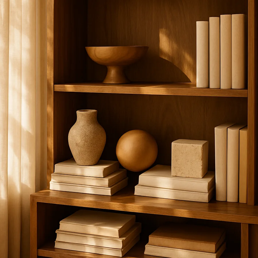
The Vertical And Horizontal Book Stack Combination
One of the most underused techniques in bookcase styling is mixing vertical and horizontal book stacks within the same shelf. Most homeowners arrange all their books vertically because that is how books traditionally sit on shelves. But pure vertical arrangement creates the same relentless texture problem we discussed above. Introducing horizontal stacks of three to five books within the vertical lineup immediately adds visual rhythm and creates platforms for objects to sit on.
A horizontal stack also provides a flat surface where you can place a small sculpture, a framed photograph, a candle, or a plant. This is where the layering really begins. The horizontal book stack becomes a pedestal, and the object on top becomes the focal point. The vertical books on either side become the textural context that makes the focal point register. House Beautiful has demonstrated this technique repeatedly in its bookcase features, and the consistency of the approach across very different design styles speaks to how reliably it works.
For balance, aim to have at least one horizontal stack on each shelf, ideally placed at different positions across shelves so the eye has a varied rhythm to follow as it scans the bookcase from top to bottom. Avoid placing horizontal stacks in the same position on every shelf, which would create a rigid grid that feels overdesigned. Variation is what makes the styled bookcase feel organic and lived-in rather than mathematically constructed. Why does asymmetric placement work so well across shelves? Because the eye is naturally drawn to variation rather than repetition, and the bookcase becomes more interesting to look at the more your placement choices avoid mechanical predictability.
Choosing Objects That Earn Their Place
Not every object deserves to share shelf space with your books. The best bookcase objects share a few common qualities. They have presence, meaning they are substantial enough to register from across the room rather than disappearing into the background. They have personal meaning, connecting to your travels, your family history, or your interests. And they have visual variety, contributing texture, color, or shape that the books alone cannot provide.
Common categories of bookcase objects include sculptural pieces in stone, wood, or ceramic, framed photographs of people or places that matter to you, decorative boxes that add geometric mass and can also serve practical storage, small plants in elegant vessels, and natural objects like geodes, shells, or weathered driftwood. Pantone has noted in home decor commentary that natural materials have become increasingly important as visual anchors in residential design because they bring textural variety that manufactured objects struggle to replicate.
Avoid the temptation to fill empty shelf space with whatever you have on hand. The bookcase is not a parking lot for objects without homes elsewhere. Every object should be chosen with intention, and if an object does not earn its place, it belongs in storage or in another room where it can shine. Architectural Digest has emphasized in many residential coverage features that the best styled bookcases in the world tend to include surprisingly few objects relative to the size of the bookcase. Restraint is the secret ingredient, and over-styling is the most common mistake homeowners make.
Color Rhythm Across Shelves
One of the most sophisticated styling moves is creating intentional color rhythm across the entire bookcase. Books come in every conceivable color, and most home libraries are accidentally rainbow-coded by the random chronology of when each book was acquired. By rearranging books with attention to color, you can create either a deliberate gradient effect, a balanced distribution, or an accent strategy where certain colors anchor specific shelves.
The trendy color-by-spine approach has its critics, but it can work beautifully when executed with restraint. Instead of arranging every book by exact color, try grouping books loosely by color family. Place the warm-toned books, like reds, oranges, and yellows, on certain shelves and the cool-toned books on others, then use objects to bridge the transitions. This creates color zones that the eye reads as intentional without the mechanical perfection of strict rainbow ordering.
Sherwin-Williams educators have noted in interior color guidance that color rhythm on vertical surfaces is one of the most powerful tools for creating visual flow in a room. A bookcase that feels chaotic in color often comes alive when its books are simply regrouped by tonal family, with objects placed at the transitions to soften the shifts between zones. Have you looked at your bookcase recently and asked whether the color story is working for you or against you? Even a thirty-minute reorganization session focused purely on color can dramatically improve the visual impact of an existing bookcase without buying anything new.
The Critical Role Of Negative Space
Every shelf in a styled bookcase needs negative space. This is the visual breathing room that allows the styled elements to register clearly, and it is one of the most counterintuitive aspects of bookcase styling for most homeowners. The instinct is to fill every inch of every shelf because empty space feels wasteful. But empty space is not wasted. It is what gives the filled space its visual power.
A practical guideline is to leave roughly 20 to 30 percent of each shelf visibly empty, either as space at the end of a row of books or as a gap between book stacks and objects. This empty zone gives the eye a place to rest and creates the sense of room for things to breathe. Without negative space, the bookcase reads as overcrowded regardless of how beautifully each individual element is styled.
Better Homes and Gardens has covered this principle in its home organization features extensively, noting that even closets and pantries benefit from intentional negative space that prevents visual fatigue. On a bookcase, the principle becomes even more important because the bookcase is meant to be looked at rather than just functioned with. The empty space is what gives the filled space its meaning, and learning to leave shelves intentionally underfilled is the mark of a developed design eye. Why does negative space register as luxury? Because it signals abundance of resource, which the eye reads as sophisticated rather than cramped.
Practical Adjustments For Different Bookcase Styles
Built-in bookcases, freestanding modular shelving, and ladder-style bookcases each call for slight variations of the same core styling principles. Built-in bookcases that span an entire wall benefit from intentional symmetry across the central axis, with the eye finding a balanced composition when looking at the wall as a whole. Within that overall symmetry, individual shelves can still be styled asymmetrically for visual interest.
Freestanding modular shelving, like the popular cube-style bookcases, presents a different challenge because each cube becomes its own miniature vignette. Treat each cube as an independent styling exercise while still considering how all the cubes relate to one another. A reliable approach is to alternate between books-only cubes, objects-only cubes, and mixed cubes, distributed across the bookcase in a balanced pattern. This avoids the visual monotony of styling every cube the same way.
Ladder-style bookcases, which taper from wider at the bottom to narrower at the top, naturally guide larger objects to lower shelves and lighter, smaller objects to upper shelves. Embrace this gravitational logic rather than fighting it. Heavy art books and substantial sculptures belong at the bottom, while smaller framed photos and lightweight ceramics belong at the top. The American Society of Interior Designers has long emphasized that the bookcase should respect the laws of visual weight, with heavier elements grounding the composition and lighter elements rising above. Have you considered whether your current bookcase arrangement honors or violates this principle of visual gravity?
Conclusion
A styled bookcase is one of the most rewarding design projects a homeowner can undertake. It costs nothing if you already own books and a few decorative objects. It dramatically improves the visual richness of an entire room. And it provides ongoing pleasure as a constant reminder of your reading life, your travels, and your collected memories. The framework is simple. Mix books and objects in roughly a 70 to 30 ratio. Combine vertical and horizontal book stacks. Use objects with presence, meaning, and visual variety. Pay attention to color rhythm across shelves. Leave generous negative space. And respect the visual gravity of the bookcase itself.
What separates a great styled bookcase from a mediocre one is intention. Every choice should be deliberate. Every object should earn its place. Every shelf should have its own composition that also relates to the shelves above and below. This level of intention sounds exhausting in description, but in practice it becomes intuitive after the first thoughtful styling pass. Once you have arranged the bookcase with care, maintaining it requires only periodic editing rather than constant overhaul.
One of the underrated benefits of bookcase styling is what it teaches you about your own collection. As you handle each book and each object, you develop a clearer sense of which titles you actually want to keep visible and which can move to less prominent storage. The styling process becomes a kind of curation that sharpens your relationship with your own library, your own art, and your own memories. The bookcase becomes not just a piece of furniture but an evolving portrait of your interior life.
Ready to transform your bookcase into the styled centerpiece your room deserves? Start by removing everything from one shelf at a time, rather than trying to tackle the entire bookcase at once. Edit ruthlessly, keeping only what earns its place. Mix with intention, layer with restraint, breathe with negative space, and your bookcase will become not just a place to keep books but one of the most personal and beautiful surfaces in your entire home.
More Articles You May Like


Comments
Post a Comment